ProcrastiGreat
A self-compassion-focused planning app for neurodiverse Gen-Z that embraces the power of procrastinating productively.
Overview
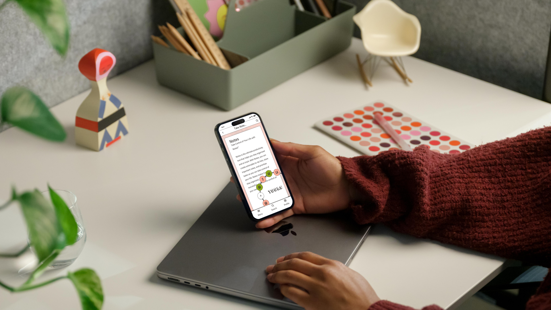
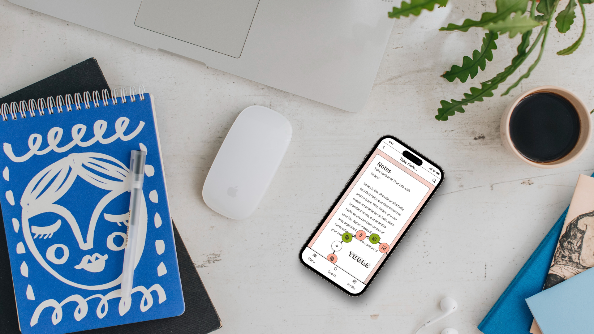
This iOS productivity app, designed for neurodiverse Gen-Z humans, emphasizes calming, accessible features that cater to their unique planning habits and meet the needs of users who often embrace procrastination as a tool for creativity.
Guided by secondary research on Gen-Z and neurodiverse design, ProcrastiGreat features include task chunking, prioritization, and various planning methods.
Inspired by Neo-Brutalist designs trending with Gen-Z the app design includes handmade icons, and developer-friendly annotations blending Gen-Z's preference for bold visuals with accessible and user-centered neurodiverse design principles.

-
Background & Description
This was the first project from the Career Foundry UI Bootcamp course.
Problem
Identify a user demographic that would benefit in 2024 from a mobile productivity app and design “sky-is-the-limit” features and visuals to meet the needs of the user identified.
Goals/Project BriefPractice and apply consistent UI visual skills knowledge of design elements, principles, and heuristics
secondary research based user profileUser centered neurodiverse UI design research and application
Deliverables: task lists, and the ability to mark tasks as complete, 2-3 new functions added based on user research, Analysis of two competing apps, mobile screens at low, mid, and high fidelity with annotations,
a visual design inspiration board, a set of 3-5 icons, a typography stylesheet, and two color palette options with HSL, HEX, and RGB codes
-
Gen-Z neurodiverse want a productivity app that will not stress them out or overwhelm them.
Many are learning to embrace their tendency to procrastinate as as a super power versus allowing their natural procrastination habits to create unproductive shame spirals.
The name ProcrastiGreat comes from this ideal as a laid back but powerful planning app for the ProcrastiNation.
Research-based checklists for neurodiverse and Gen-Z users identified goals like task chunking, pastel colors, and eye catching visuals.
Identifying familiar UI patterns like circular progress indicators and smart table Kanban boards in popular planning applications led to inspiration on how to present visual interactions in the app.
-
Mobile Screen Features
Task chunking with time blocks - Pomodoro timer & Kanban Board screens
Variety of connected planning methods to appeal to inattention
Task prioritization and backlog to help reduce analysis paralysis
Brainstorm whiteboard space for working through tasks & visual note taking
Habit tracker concept based on non-shame focused long-term pattern building
Calm note taking space with organization features
Bold but accessible color and font choices
User Research
“In a recent survey, 53% of Gen-Z say they identify as neurodiverse.”
“I struggle to stay focused and organized when using mobile apps for planning tasks.”
“65% of Gen-Z individuals find it challenging to prioritize and plan tasks effectively using mobile apps.”
“Although it is widely assumed that procrastination is counterproductive, delaying task progress may have hidden benefits for creativity.”
Competitive Analysis
The Streaks habit tracking circular progress indicators with editable icons identify each habit and linked data graphs to show habit progress over time.
The Toggl Pomodoro timer with a reduction oriented circular progress indicator screen anchors tasks to time charts.
Sketches & Wireframes
Mid-Fidelity Screens
The Figma plugin Measure was used to annotate screens for developers with UI feature pixel distances.
Style Guide
Hi-Fidelity Screens

Reflection
I considered playing it safe with more muted design visuals to reduce overstimulation but dove into Gen-Z trending Neo-Brutalism instead. This design choice felt right in the end once I was able to conquer color contrast accessibility concerns.
Details get me stuck looking for the perfect pixel or make me miss feedback. I found that open compassionate communication efforts in relation to feedback helped to get clarity on changes and helped me find ways to see the details with new eyes.
Future goals for this assignment could look like user testing to identify priority features for further development of interactions & creation of a developer handoff packet with more detailed annotations and a dedicated Figma file.
