SoloDareity
Responsive, location-based reviews and safety maps for solo female travelers by solo female travelers.

Overview
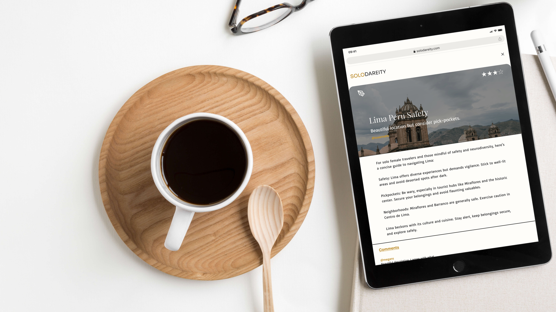
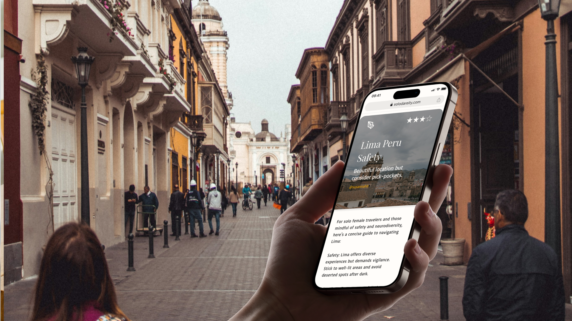
This UX design project for the Career Foundry UI bootcamp focuses on creating a responsive web app to address safety concerns for solo female travelers.
Through secondary web-research and primary research user interviews, three user personas emerged: Road Trippers, Digital Nomads, and Introverted Explorers. All travelers shared key pain points—travel safety in low wifi zones and independent travel empowerment.
Using the Jobs to Be Done framework, four main task goals were identified: writing a review, reading a review, downloading safety maps for wifi support, and getting travel alerts.
Visual branding choices were focused on supporting clean, minimal & confident design. The name SoloDareity came from the words Solo and Dare. An unmoderated preference test helped identify the hero image and results mirrored minimalist visuals.
Early agile usability testing revealed key design adjustments for clarity and accessibility, with final feedback shaping features such as CTA buttons, map downloads, and hero images.
Details
-
Background:
This Career Foundry UI bootcamp course project focused on user research and responsive design. The project brief required designs for a responsive web app for location-based recommendations that meets the requirements of a specific user and solves the related problems they face with existing location-based recommendation apps.
Problem:
Identify a user demographic with strong pain points related to travel reviews web-application use, determine features that will counter their pain, and design the user experience for mobile, tablet, laptop and desktop.Goals:
Conduct primary and secondary user research to reveal a user and their needs
Design & test human centered, responsive user stories, wire flows, and screens
Curate and test inclusive and accessible user interface content and visuals
-
Web based secondary research, personal experience as a solo female traveler, and access to a network of other solo female travelers, led to a focus on this demographic.
Original demographics also included other historically stigmatized communities like Neurodiverse, LGBTQ, & BIPOC humans. Limited access to these communities for primary research interviews, led to a focus on the solo female traveller only.
Competitive analysis of popular travel apps Airbnb and TripIt reveal the importance of authenticity, reviews support, and safety maps.
User interviews reveal pain points related to trusted advice on wifi-access points and safety when traveling and identified three different user personas related to methods of preferred travel. -
Jobs to Be Done to help solo female travelers feel confident with independent travel and find reliable wifi and safety zones include:
When I travel, I want to leave safety reviews so I can help others that are traveling find locations that are safe.
When I travel, I want access to reliable downloadable safety maps for chosen areas so I can easily route the safety maps when I am traveling in low wifi zones.
When I travel, I want to get travel alerts about trip events so that I do not miss them and end up in an unsafe situation.
When I travel, I want to read safety reviews so I can feel safer as a female solo traveler.
-
Visual design for this application included the creation of two mood-boards, a style guide and an unmoderated preference test for the hero image.
Users preferred inclusive, minimal and clean visuals that also presented peaceful confidence themes vs bolder ones.
-
Early stage agile wireframe prototype testing identified issues with visual interactions of map downloads but revealed the other Jobs To be Done tasks as successful.
Feedback from other designers led to multiple iterations of the hi-fidelity responsive screens with changes related to color contrast increase for accessibility, visual card presentation, and font hierarchy.
Secondary Research
40%
“of women said that concerns about their safety are the main thing that would stop them from solo traveling.”
What responsive web app features will they need to help them feel safer and what are competing products doing wrong?
CompetitiveAnalysis
Airbnb has strong visuals and customer loyalty but is losing ratings due to values changes and less support of host reviews. This creates safety concerns.
TripIt’s safety maps and their strong, secure offline data support are a win for solo-female travelers. Outdated visuals and limited web app features could be improved.
User Personas
“I want safety ratings for remote travel locations so that I can independently explore off the beaten path confidently without tourist crowds.”
“As a road-trip traveler, I want ratings for travel locations and experiences from travelers like me while I am on the road so that I can feel safer while traveling.”
“As a remote worker, I want access to ratings for safety and wifi accessibility so that I can find spots to get work done or to access emergency support.”
Jobs to Be Done Based Wire Flows
Sketch Based Prototype & Testing
3
Moderated Usability Tests
Tasks
Create an account
Find a user review and create a new review
Find the safety maps and download a map
Upload travel documents to user profile and add reminders
Testing Results
All three users completed the tasks with more than one mistake.
Most mistakes were made related to early stage prototype representation concerns and downloading the safety map.
To make the safety map download more clear, a tab and full page with examples was planned for the maps.
Mood Board & Style Guide
Un-Moderated Preference Test
The hero image is vital to making an impact. Using the Lyssna testing program, this test determined the stronger image.
41%
7/17 participants preferred the bolder color hero image for the home page.
59%
10/17 participants preferred the softer color hero image for the home page.
Feedback Iterations
Before
The card images needed to be bigger for visual clarity.
The CTA buttons needed to pop more.
The footer needed tighter spacing to look more connected.
After
The images were expanded to fill the cards.
A second font was added for stronger hierarchy.
A darker primary brand color made buttons AAA WCGAG friendly.
The width was expanded to the edges for easier touch interaction.

Reflection
Without access to more underrepresented real users that struggle with travel safety this project focused on women but highlighted a passion for inclusion design.
Female solo travelers liked the reviews concept as a way to feel safer through support from fellow travelers like them. Getting more detailed success research on solo female travelers value for the features is needed to define future success.
Responsive screen design requires strong organization of visual assets, this project helped identify new tools to help organize larger projects.


